
Cashmere's Hollow Fibre and How It Affects Colour Perception
I spent way more time in Mr. Ghulam's shop than I meant to. I mean, there are other things to do in Pokhara, after all. I could have taken a boat to see the sunken temple, or taken a thanka painting class. But I have a weakness for lovely textiles, and I enjoyed just looking at the cashmere.
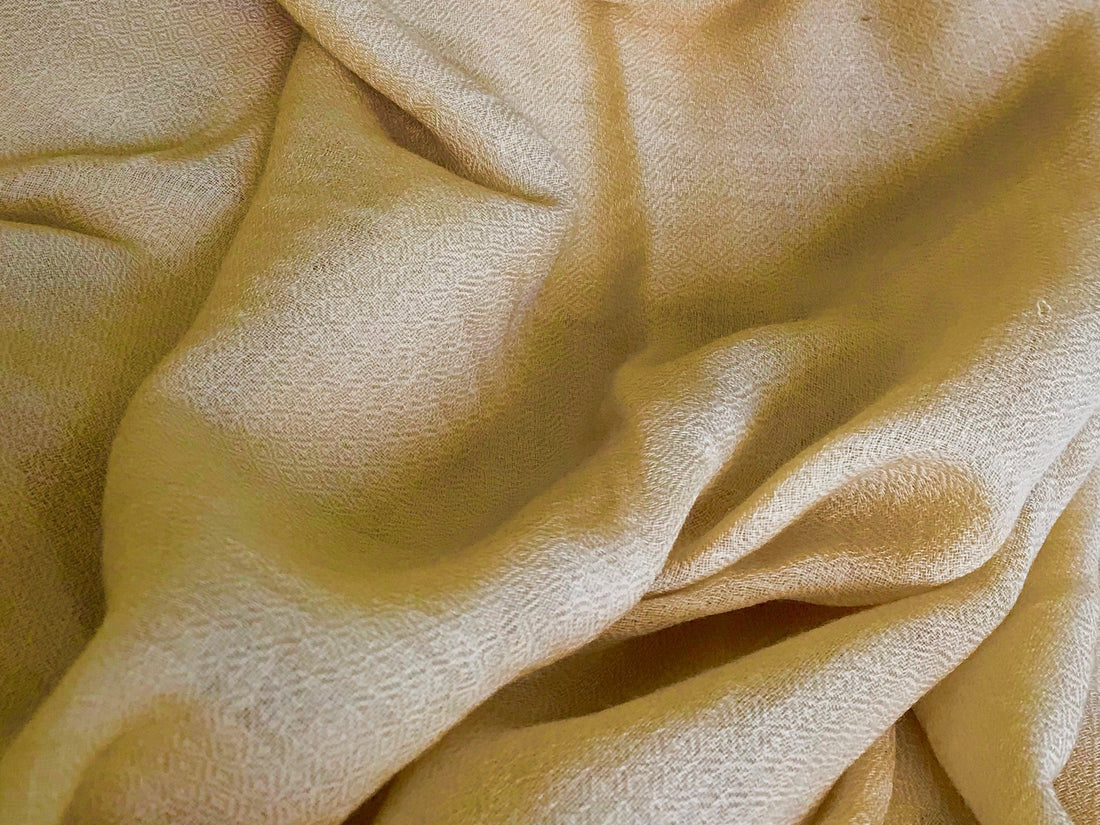
Aside from being soft, it is also a fine fabric, draping lightly and fluidly, especially the thinnest weaves. And the colours! There was a subtle sheen to it - not as obvious as satin or silk, but just enough to let you know this isn't wool or cotton.
~
Fast forward to the beginnings of our Ethical Cashmere online store. Jason tries to choose colours for the product images all the way in Melbourne.
"I've seen the cream, that looks too white," I tell him from Kuala Lumpur. "Are you sure the camera isn't getting the colour wrong?"
"No, it isn't," he insisted. "Not under studio lighting."
"Look, even on the model photo in the studio. There's a tiny bit of yellow. Cream." But he showed it to me under bright sunlight, over Skype. He's right. It's really, really pale under a lot of light.
But... I'm also right. If you folded the cream scarf and took its picture indoors, it looks like a very light beige cashmere scarf.
Huh. Cashmere doesn't quite photograph like other fabrics.

The colour side effect of cashmere's hollow fibres
I soon realised that this subtle play of colour is related to the same trait of cashmere that makes it so light, yet so warm - its hollow fibres. Cashmere's hollow fibres make it lightweight, while trapping more air and making it warmer than you'd expect.
But do you know what else goes in there? Light.

This means cashmere doesn't just reflect light according to the colour it's dyed. Some light passes within the fibres, and comes back out somewhere else along the material. In between, interesting things happen, especially if the light itself is coloured. It's sort of like how the translucent white marble of the Taj Mahal acquires a subtle pink or gold tint depending on morning or evening light.
You know what they say about the human eye being a lot more accurate than cameras? True for cashmere. The camera can't deal with this effect very well, which made taking accurate colour photographs more difficult.
We came to learn a little bit about what makes the eye perceive different colours as different, and editing for colour, to ensure that the product image matches the tint that the scarves would generally have in real life to the naked eye - individual monitor and browser settings aside, of course.
So, we thought we'd compile our experience so far into a set of tips for you!
When you're browsing Ethical Cashmere's product selection...
All the following effect variations we're about to describe are subtle. If you just need the colour to be a general sort of colour (e.g. "I am just looking for a dark red"), then there's no need to overthink this - the product image will do. Chances are, you wouldn't perceive any variations as a 'different' colour at all, only a 'play' of colour. Our existing customers and friends generally appreciate the surprise of how cashmere lustre differs from other scarves they've had in the past!

However, if you are looking for specific shades (or want to make sure a disliked shade is definitely not in the range of tints in any kind of lighting condition), send us a message!
Cashmere online shopping tips for colour perception
An online store should have taken steps to consider the photography implications of cashmere's special attributes, and compensated accordingly. Consequently, these tips are intended more to help the online shopper appreciate the colour behaviour of cashmere which we consider a 'bonus', since it is responsible for cashmere's more luxurious appearance compared to other winter fabrics.
So, what sorts of things can influence your colour perception of cashmere?
1. Whether the cashmere is folded
Unsurprisingly, folded cashmere appears less remarkable, since there's not much light penetration happening. This is when it looks the most flat and not very special. We tend to encourage the customer to open the package and unfold the scarf, indoor and in natural light, before deciding if the colour expectation is too different.
For a scarf with thicker weave, the colour difference is not as noticeable after you unfold it. But for thinner weaves, it can be quite remarkable, especially the paler colours like beige or cream, which tend to appear several shades darker when folded. Our EVERYDAY diamond-weave cashmere shawl is thin enough to show this effect, despite being heavy enough for autumn to spring.
The photo below shows the same scarf as in the article header image when it's folded vs a single layer under indoor lighting. As you can see, the shade can range from a solid beige cashmere scarf to a dark cream colour.

2. Whether the cashmere is indoors or outdoors
The shade of the cashmere scarf can also vary depending on whether it is worn indoors or outdoors. There is usually less light indoors, and domestic lighting tends to be warmer (yellower) than bright daylight. Yellower light from indoor lighting or evening light can add a warmer shade to your cashmere scarf. For example, a pink scarf may appear more like a peach pink.
From our experience so far, the light pastels (e.g. the light blue cashmere scarves) and pale neutrals (e.g. taupe greys, beige scarves) seem to respond to light mostly similarly indoors or outdoors.
However, for some reason, darker colours seem to be more impressive indoors. The two darkest colours we have had on the store, the Forest Green and Pepper Red, appear slightly glossy indoors. I'm not sure why, and it's quite hard to render the effect in a photo.
3. What colour the cashmere is dyed in
It would be so much more convenient if you could have just a couple of rules of thumb to set cashmere colour expectations. Yes, paler colours tend to give more luminance with more light. Yes, for some reason dark, richer colours are somehow more glossy indoors.
But then there are the other colours, that just seem to do their own thing.
Is it brown/russet coloured?
The brown cashmere scarves seem the easiest to photograph, even when they are different shades of brown (e.g. the Copper Orange from the range, shown below, and brown scarves in the EVERYDAY Neutrals range). Digital cameras seem less confused by them. The colour tends to be stable across lighting changes as well.

Is it red or orange?
You might think that brown/copper is not that different from the reds. (Well, I did). But no.
I mean, yes, in terms of a stable colour perception. But there's something special about red cashmere scarves. All the red scarves and the Tangerine Orange (photo below) flash a bright colour under direct sunlight, although it's less dramatic with the darkest red, the Burgundy Christmas Limited Edition (discontinued).

The Scarlet Red in particular, can be so bright that the image loses definition when photographed.

Is it pink?
By far the colour that personally baffled me the most, is the Princess Pink. The reason is that it doesn't just attain luminance or flash in the sun, it seems to shift in hue as well.
I eyeballed it myself, taking images of a single scarf in different conditions, checking it against images others have taken. Indeed, most of the time it's a candy floss/ Disney Princess pink, but at times it appears slightly warmer, just a tinge of coral. Yet paradoxically at other times, it also somehow appears bluer - a cooler pink?

I always thought that pink is just red with more white in it. Which works, if you're mixing a dye. But I recently learned that there isn't a 'pink light wavelength'. Pink is actually a combination of wavelengths - mostly red and blue - that we interpret as 'pink'.
While the Princess Pink is no longer in the catalog, the Peach Pink CHIC cashmere shawl has a similar effect, where the colour can seem pinker or pastel orange depending on the lighting conditions.
As far as I can tell, I don't get this problem photographing pink anything else. Soo... I guess it's down to that hollow fibre effect. Maybe, depending on how the light is interacting with the cashmere, the green could be enhanced or the blue could be enhanced - and then the hue of pink cashmere would actually seem to change!